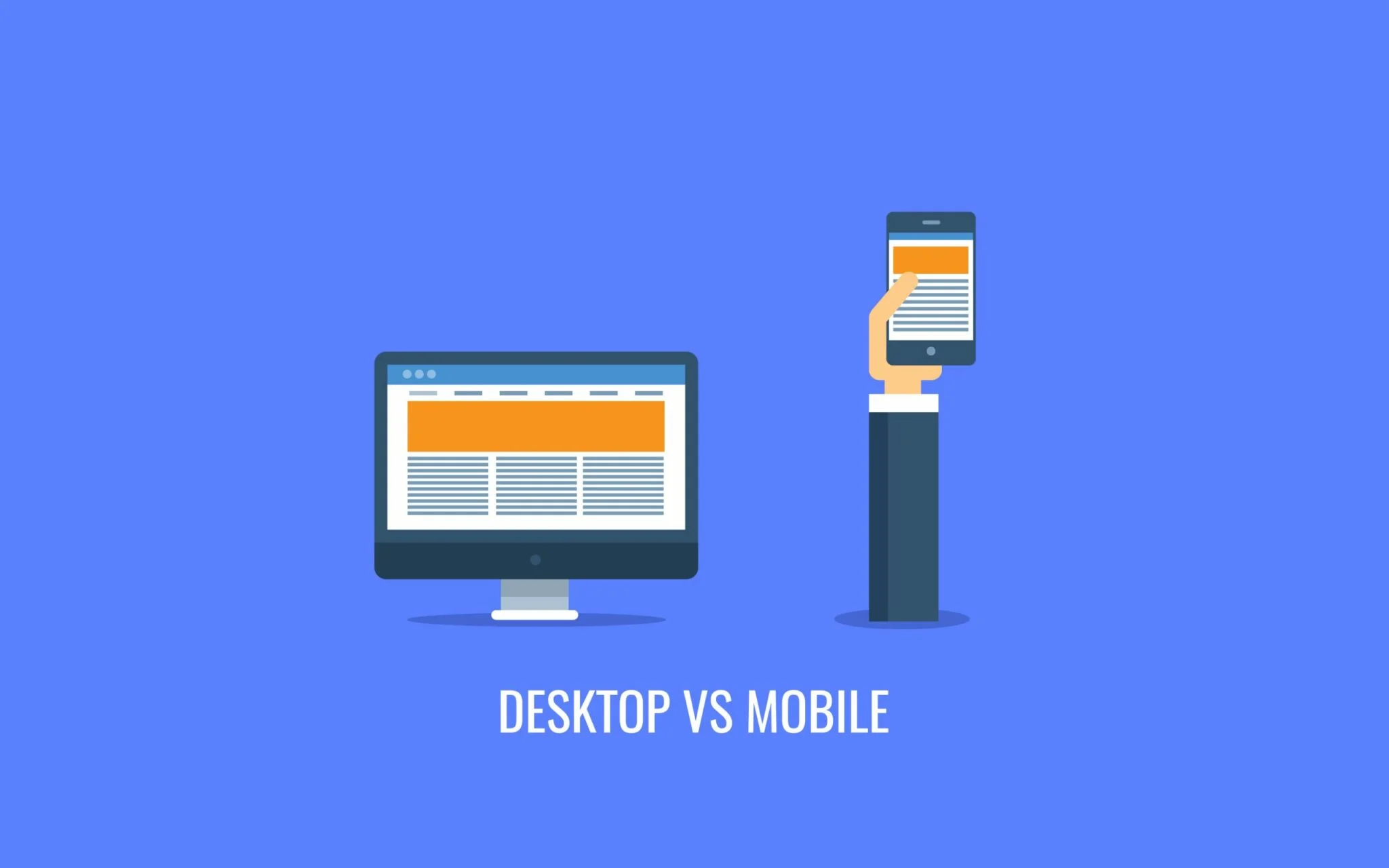
As technology advances, so does the way we consume information online. With more people accessing the internet through mobile devices than ever before, the debate over which platform reigns supreme in web traffic has become a hot topic. While desktop usage still holds a strong position, mobile usage has skyrocketed in recent years, with over half of all internet traffic coming from mobile devices.
So, what are the factors driving this shift towards mobile usage, and what does it mean for businesses? Let’s explore.
The Rise of Smartphones One of the main reasons for the increase in mobile traffic is the widespread adoption of smartphones. These devices are more affordable and accessible than ever before, with many people preferring the convenience of having everything they need in the palm of their hand. As a result, mobile devices have become the primary tool for accessing the internet for many people.
Changes in Search Algorithms Another factor driving the shift towards mobile usage is changes in search algorithms. Google, the dominant search engine, has been giving preference to mobile-friendly websites in its search results since 2015. This means that businesses that prioritize mobile optimization are more likely to appear at the top of search results, increasing their visibility and driving more traffic to their website.
What Does this Mean for Businesses? For businesses, the rise of mobile usage presents both opportunities and challenges. On one hand, optimizing websites for mobile devices is essential for increasing visibility and attracting more traffic.
To address this, businesses should consider implementing responsive design, which ensures that their website looks and functions properly on any device, regardless of screen size. In addition, businesses should focus on creating content that is easily accessible and digestible on mobile devices, such as short-form videos, infographics, and bite-sized articles.